Make Responsive
Adapt existing designs to work across mobile, tablet, and desktop breakpoints.
Installation
Run the ui.sh installer to add this skill in your project:
To install multiple skills at once, omit the skill name from the command:
Make layouts responsive
Use the make-responsive skill to adapt an existing desktop-oriented UI for mobile, tablet, and desktop breakpoints:
/make-responsive
The skill fixes common responsive issues, like setting text inputs to at least 16px on iOS Safari to prevent focus zoom:
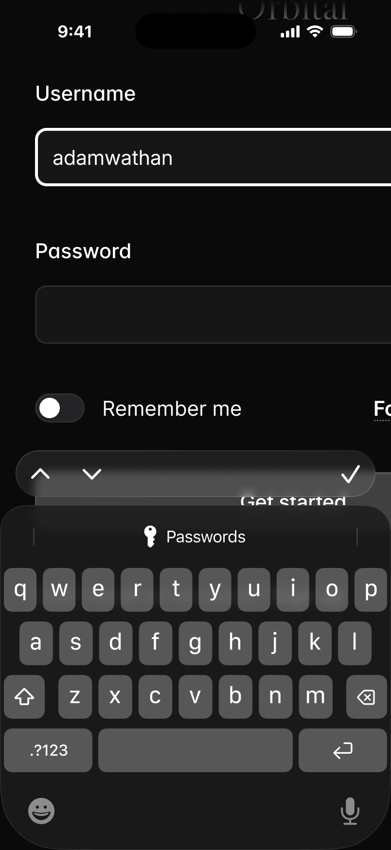 text-sm
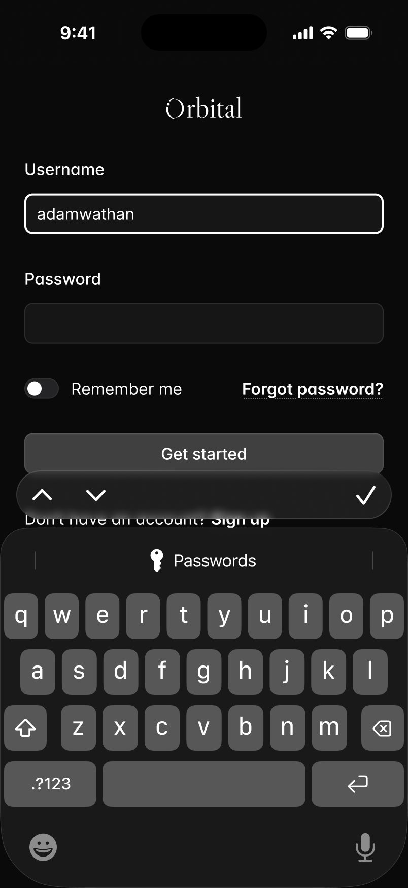 text-base sm:text-sm
It also adds mobile navigation when needed, a detail agents often overlook:


It also increases body text size on mobile while keeping the same spacing, creating a more natural mobile experience:
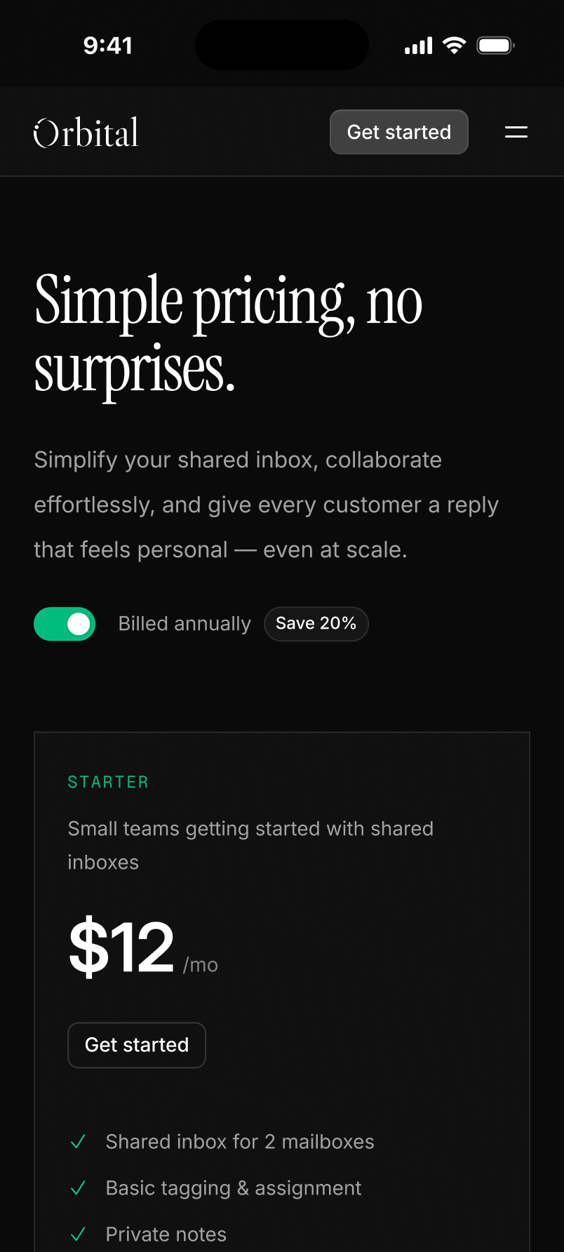 text-basetext-xstext-sm
 text-lgtext-smtext-base
What this skill does
- Adapts desktop-oriented UI for phones, tablets, and desktops.
- Fixes overflow, clipping, awkward wrapping, and cramped controls.
- Adds responsive behavior for navigation, forms, tables, cards, and touch targets.
- Checks the layout at mobile, tablet, and desktop sizes.